Pink is a color that has captivated artists, designers, and cultures worldwide for its unique aesthetic and symbolic meanings. At its core, pink is a tint of red, achieved by mixing red with varying amounts of white. This results in a range of hues from soft, pale pinks to vibrant, hot pinks. The specific hue of pink can convey different emotions and meanings, making it a versatile color in various contexts.
In art, pink has been used historically to depict certain moods and themes. During the Renaissance, pink was often used for its realism in portraying human skin tones. In modern art, pink has taken on more diverse roles, symbolizing everything from innocence and sweetness to boldness and rebellion. Artists have used pink to challenge traditional notions of masculinity and femininity, as seen in the works of contemporary artists who embrace pink for its ability to draw attention and provoke thought.
In design, pink has a significant impact on visual aesthetics. It is widely used in interior design, fashion, and graphic design to create a sense of warmth, comfort, or playfulness. Different shades of pink are employed to evoke different responses – pale pinks are often used in spaces seeking to be calming or romantic, while brighter pinks are chosen for their energetic and eye-catching properties.
Culturally, the significance of pink varies greatly around the world. In Western cultures, pink is often associated with femininity and is frequently used in marketing products towards women and girls. This association, however, is a relatively modern development, dating back only to the mid-20th century. In contrast, in some parts of East Asia, pink is associated with good health and life, often used in celebrations. The cherry blossoms of Japan, known for their iconic pink blooms, are celebrated for their fleeting beauty and have deep cultural importance.
The understanding of pink in color theory is rooted in the study of primary colors – red, blue, and yellow – which are considered the basis of all other colors. By mixing these primary colors, secondary colors (green, orange, and purple) are created. Tertiary colors are formed by mixing primary and secondary colors. Pink, however, is somewhat unique in this context. It is not a color that can be created by simply mixing primary and secondary colors. Instead, pink is achieved by diluting red with white, which lightens the color without changing its basic hue.
This brief overview of pink in different contexts highlights its multifaceted nature and its ability to convey a wide range of emotions and ideas. Whether in art, design, or culture, pink continues to be a color that captures attention and sparks imagination, making it a subject of endless fascination and exploration in the visual world.
Basic Color Theory
Basic color theory is an essential foundation for understanding how colors interact, how they are formed, and the impact they have on both art and perception. At the heart of this theory are the concepts of primary, secondary, and tertiary colors, along with the color wheel, and the categorization of colors into warm and cool tones.
Primary Colors: Primary colors are the cornerstone of color theory. They consist of red, blue, and yellow. These colors are called 'primary' because they cannot be created through the mixing of other colors. They are pure, fundamental colors from which all other colors are derived. In the realm of painting and traditional art, these colors hold a central place because they provide the starting point for creating a wide spectrum of other hues.
Secondary Colors: When two primary colors are mixed together in equal measure, they produce a secondary color. The secondary colors are green (a mix of blue and yellow), orange (a mix of red and yellow), and purple (a mix of red and blue). These colors are positioned on the color wheel between the primary colors that combine to make them, illustrating their direct relationship with the primary colors.
Tertiary Colors: Tertiary colors result from the mixture of a primary color with a secondary color adjacent to it on the color wheel. These colors are usually named by combining the names of the primary and secondary colors. Examples include red-orange, yellow-orange, yellow-green, blue-green, blue-purple, and red-purple. Tertiary colors help create a more nuanced and diverse color palette, allowing for more complex and subtle color gradations in art and design.
The Color Wheel: The color wheel is a circular diagram that represents the relationships between colors. It visually illustrates how primary, secondary, and tertiary colors relate to each other. The color wheel is an invaluable tool for artists and designers, as it helps in understanding how different colors interact, how they can be combined harmoniously, and how they contrast with each other.
Warm and Cool Colors: Colors are also categorized based on their temperature: warm and cool. Warm colors include reds, oranges, and yellows. These colors are often associated with warmth (like the sun) and are thought to evoke feelings of energy, passion, and excitement. They are used in design and art to attract attention and create a sense of coziness and warmth.
Cool colors, on the other hand, consist of blues, greens, and purples. These colors are reminiscent of water and the sky. They are typically associated with calmness, serenity, and relaxation. In design, cool colors are often used to create a sense of tranquility and space.
Understanding these basic principles of color theory is crucial for anyone involved in the visual arts, design, or any field where color plays a key role. It not only helps in creating visually appealing and effective compositions but also in conveying the intended emotional and psychological impact through the use of color.
Creating Pink: The Basics
Creating pink through color mixing is a fundamental aspect of color theory and artistry. The basic principle involves blending red and white, where the variation in proportions and the type of red used can result in a wide spectrum of pink shades. This process is not only central to artistic endeavors but also significant in design, fashion, and various forms of visual media.
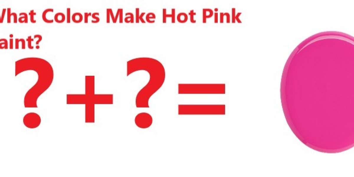
Mixing Red and White: The most straightforward method to create pink is by mixing red and white paint. When red, a primary color, is lightened with white, the result is pink. The exact hue of pink depends on the ratio of red to white. A higher proportion of red results in a darker, more saturated pink, often referred to as hot pink or fuchsia. Conversely, adding more white produces a paler, softer pink. This method of mixing allows for a high degree of control over the resulting shade of pink.
Variations in Shade: The shade of pink can vary significantly based on how much red is mixed with white. Light pinks, often seen as delicate and soft, contain a higher ratio of white. These lighter pinks are frequently associated with themes of romance, gentleness, and femininity. On the other end of the spectrum are the bold, vibrant pinks that emerge from using more red. These intense pinks are eye-catching and convey feelings of excitement, fun, and confidence.
Impact of Different Reds: The specific type of red used to mix with white can greatly impact the resulting shade of pink. Reds can vary in hue, temperature, and intensity, which in turn affects the pink.
Crimson: Crimson is a deep, rich red with a slightly bluish tint. When mixed with white, it yields a cooler, more purplish pink. This kind of pink can have a sophisticated and somewhat regal appearance, often used in more formal or elegant designs.
Scarlet: Scarlet, on the other hand, is a brighter red with orange undertones. Mixing scarlet with white produces a warmer, more vibrant pink. This shade of pink is perceived as energetic and playful, making it a popular choice in youthful and lively designs.
Other Reds: Other variations of red, like cadmium red (which has a bit of orange) or alizarin crimson (which leans towards purple), will also produce different pinks. These subtleties allow artists and designers to choose the exact mood and tone they wish to convey in their work.
Understanding the nuances of creating different shades of pink by manipulating the ratio of red to white, as well as the type of red used, is crucial for artists, designers, and anyone working with color. This knowledge enables the creation of a specific aesthetic and emotional impact, making pink a versatile and expressive color in the palette.
Advanced Color Mixing Techniques
Advanced color mixing techniques go beyond the basic blending of red and white to create pink. By introducing additional colors like blue, purple, or yellow, and by manipulating color intensity and brightness, a vast array of pink hues can be achieved. These techniques allow for more nuanced and sophisticated color creation, catering to specific aesthetic needs and artistic intentions.
Mixing Pink with Blue or Purple: When a small amount of blue or purple is added to pink, the result is a cooler, more nuanced shade of pink. This technique is particularly useful for creating pinks that need to convey a sense of calmness, sophistication, or subtlety.
Adding Blue: Introducing a bit of blue into pink creates a cooler hue, often referred to as a "cool pink." This cooler pink can lean towards lavender or mauve, depending on the amount of blue added. These pinks are excellent for achieving a serene or more formal aesthetic, as they tend to be less vibrant and more muted.
Incorporating Purple: Adding purple to pink results in a rich, deep hue that maintains the warmth of red but with a hint of royal elegance that purple brings. This combination is often used in more luxurious or opulent designs, as it creates a sense of depth and complexity in the color.
Adding Yellow for Warm, Peachy Pinks: On the opposite end of the spectrum, infusing pink with a small amount of yellow yields a warmer, peachier hue. This technique is particularly effective in creating pinks that exude warmth, comfort, or a more playful and approachable vibe.
- Warm Peachy Pinks: The addition of yellow transforms the coolness of pink into a warmer, more inviting hue. These peachy pinks are often associated with spring and summertime aesthetics, conveying a sense of freshness, vitality, and cheerfulness.
Role of Color Intensity and Brightness: The intensity and brightness of the colors used in mixing significantly impact the final hue of pink. Manipulating these aspects allows for an even finer degree of control over the color outcome.
Color Intensity: The intensity or saturation of a color refers to its purity. A highly saturated pink is vivid and bold, while a less saturated pink is more subdued and muted. Adjusting the intensity of the pink or the colors added to it can create a range of effects, from striking and dramatic to gentle and understated.
Brightness: Brightness, or the lightness of a color, affects how the pink is perceived. Brighter pinks, with more white or light-colored additives, can appear airy and ethereal, while darker pinks, achieved by adding darker reds or a touch of black, tend to be more somber and rich.
By mastering these advanced color mixing techniques, artists and designers can achieve precisely the right shade of pink needed for their project. Whether aiming for a cool, sophisticated mauve, a warm, inviting peach, or anything in between, understanding the interplay of color, intensity, and brightness is key to successful color creation.
Pink in Different Mediums
The creation and perception of pink can vary significantly across different mediums, such as paint, digital, and print. Each medium has its unique characteristics and constraints that affect how pink is mixed and perceived. Additionally, external factors like lighting and surrounding colors play a crucial role in how pink is ultimately seen and experienced.
Paint: In traditional painting, whether using oil, acrylic, or watercolor, pink is typically created by physically mixing red and white pigments. The type of pigments used can greatly affect the shade of pink. For example, oil paints often provide a richer, deeper color due to their dense pigmentation, while watercolors can offer a more translucent, delicate pink. The texture and absorbency of the painting surface also influence how the pink appears. Furthermore, the way light interacts with the pigments and the surface can change the pink's appearance, making it crucial for artists to consider their lighting conditions.
Digital: In digital mediums, pink is created using RGB (red, green, blue) color models. Unlike physical mixing, digital pink is formed by combining different intensities of red and blue light. This method can produce a wide range of pinks, from very pale to intensely vibrant, depending on the screen's color calibration and brightness settings. Digital artists need to be aware that the pink they see on their screen might not look the same on other devices due to these variations.
Print: In print, pink is created using the CMYK (cyan, magenta, yellow, key/black) color model. This process involves layering different amounts of magenta and yellow inks to achieve the desired shade of pink. The type of paper and the quality of the ink can significantly impact the final hue. Printed pink might appear different under various lighting conditions, and there can be a noticeable difference between the on-screen digital preview and the final printed result.
Impact of Lighting: Lighting plays a vital role in how pink is perceived. Natural daylight can reveal the truest form of pink, while artificial lighting can alter its appearance. For instance, fluorescent lighting can give pink a cooler tone, whereas incandescent lighting can make it appear warmer. Artists and designers must consider the lighting under which their work will be viewed to ensure the intended shade of pink is accurately perceived.
Influence of Surrounding Colors: The perception of pink is also affected by the colors surrounding it. This is due to the phenomenon of color contrast and harmony. When placed next to complementary colors (like greens or blues), pink can appear more vibrant and stand out due to the contrast. Conversely, when pink is surrounded by analogous colors (such as reds or purples), it can blend more harmoniously and appear softer. This interplay of colors is crucial in design and art, as it can significantly alter the viewer's perception and emotional response to pink.
Understanding how pink behaves in different mediums and under various external conditions is essential for artists, designers, and anyone working with color. This knowledge allows for more accurate and effective use of pink, ensuring that the desired hue and effect are achieved in the final outcome.
Cultural and Psychological Implications of Pink
The color pink holds diverse meanings and has various psychological implications that vary across different cultures. Its use in design and marketing also leverages these cultural and psychological associations to convey specific messages and evoke certain responses.
Pink in Different Cultures: Symbolism and Usage
- Western Cultures: In many Western societies, pink is often associated with femininity and tenderness and is frequently used in marketing products for women and girls. This association, however, is a relatively recent development, emerging in the mid-20th century. Historically, pink was considered a color appropriate for boys due to its closeness to red, which is typically associated with masculinity.
- Asian Cultures: In countries like Japan and Korea, pink is often seen in a more neutral or even masculine light, partly due to its association with cherry blossoms. These flowers symbolize the beauty and transience of life in Japanese culture, and their pink color is celebrated annually during cherry blossom festivals.
- Indian Culture: In India, pink is a color of hospitality and warmth. It is widely used in decorations and clothing, transcending gender norms. The city of Jaipur is known as the 'Pink City' for its distinctly colored buildings, illustrating the cultural significance of the color in the region.
Psychological Effects of Pink
- Calming Effect: Pink is believed to have a calming effect on emotions. The use of a specific shade of pink, known as "Baker-Miller Pink" or "Drunk-Tank Pink," has been explored in prisons to calm inmates. However, the effectiveness and ethical implications of this practice are subjects of debate.
- Evokes Compassion and Empathy: Lighter shades of pink are often perceived as soothing and nurturing, potentially evoking feelings of compassion and empathy. This makes it a popular choice in settings that require a comforting and caring atmosphere, like hospitals and nurseries.
- Stimulates Energy and Playfulness: Brighter and more saturated pinks can have an energizing effect, often being used to convey fun, vibrancy, and playfulness. This aspect of pink is commonly utilized in branding and marketing strategies targeting a young and energetic demographic.
Use in Design and Marketing
- Gender Targeting: Pink's association with femininity is heavily leveraged in marketing and product design targeted towards women and girls. This usage has been both celebrated for its aesthetic appeal and criticized for reinforcing gender stereotypes.
- Creating Contrast and Attractiveness: In design, pink is often used to create contrast, draw attention, and give a youthful and modern feel to products and advertisements. Its ability to stand out makes it effective for calls to action and key marketing messages.
- Conveying Luxury and Sophistication: Certain shades of pink, like dusty rose or muted blush, are used to convey luxury, sophistication, and exclusivity, particularly in the fashion and cosmetics industries.
In essence, pink's cultural and psychological implications are deeply nuanced and multifaceted. Its diverse interpretations and effects are skillfully utilized in various domains, from art and design to marketing and social settings, reflecting the complex interplay between color perception and cultural context.
Case Studies and Examples
The use of pink in art and design is rich with history and significance. From the pale, delicate pinks in Rococo art to the bold, vibrant pinks in contemporary design, the color has been employed to convey a range of emotions and themes. Exploring case studies and examples of how pink has been used in various contexts provides insight into its versatility and impact.
Real-World Examples of Creating Pink in Art and Design
- Fashion Design: In the world of fashion, pink has played a pivotal role. Designers like Elsa Schiaparelli revolutionized the use of pink with her creation of “Shocking Pink” in the 1930s. This bold, vibrant hue became a symbol of confident femininity and has influenced fashion trends for decades.
- Interior Design: Pink has been a popular choice in interior design, from the pastel pinks of the 1950s to the more recent trend of "millennial pink." This muted, dusty pink has been used extensively in modern interiors, creating spaces that feel both cozy and stylish.
- Product Design: The tech industry has also embraced pink. For example, the introduction of rose gold iPhones by Apple marked a significant moment in tech design, blending technology with fashion and broadening the appeal of tech products to a wider demographic.
Analysis of Famous Artworks or Designs Featuring Pink
- "Pink and Blue" by Thomas Wilmer Dewing (1890-1900): This painting showcases the use of soft, subtle pinks to create a dreamy, ethereal atmosphere. Dewing's use of pink in the dresses of the figures against a muted background highlights the color's association with softness and femininity.
- "The Pink Dressing Gown" by Berthe Morisot (1870): This impressionist painting uses various shades of pink to capture the light and shadow in the folds of a dressing gown. Morisot's use of pink underscores the domestic and feminine setting of the painting.
- Andy Warhol's Marilyn Monroe Series (1967): Warhol's iconic use of bold, vibrant pink in his Marilyn Monroe prints exemplifies the color's association with pop culture and celebrity. The striking pink background behind Monroe's face creates a vivid contrast, emphasizing the subject's presence and charisma.
Contemporary Art and Design
- Yayoi Kusama: The contemporary artist Yayoi Kusama has used pink to create immersive, psychedelic environments. Her installations often feature polka dots and repetitive patterns in vibrant pinks, evoking a sense of playfulness and whimsy.
- Product Packaging: Pink has been effectively used in product packaging to stand out on shelves. For instance, the cosmetics brand Glossier uses a distinct pale pink in its packaging, which has become synonymous with the brand's identity.
Pink in Architectural Design
- The Pink House in Los Angeles: This example of modern architecture uses a bold shade of pink not only for aesthetic appeal but also as a statement against conformity. The use of pink in such a large and public scale challenges traditional notions of architectural color schemes.
In essence, these case studies and examples demonstrate the diverse applications and impacts of pink in art and design. Whether through subtle, soft tones or bold, striking hues, pink's ability to convey a range of emotions and themes makes it a powerful tool for artists and designers across various disciplines. Its continuing evolution and reinterpretation ensure that pink remains a relevant and compelling color in the artistic and design worlds.
Conclusion
The exploration of pink in various contexts, from its basic creation in color theory to its multifaceted use in art, design, and culture, underscores its versatility and profound significance. Pink is not just a color; it's a medium of expression that transcends its visual presence, impacting emotions, conveying cultural messages, and embodying symbolic meanings.
Summary of Key Points:
Color Theory: Pink's creation is a primary example of color theory in action, demonstrating the relationship between primary colors (red) and how their interaction with white can create a vast spectrum of hues. Advanced color mixing techniques, involving the addition of other colors like blue, purple, or yellow, further expand the range of possible pinks, each with its own unique character.
Cultural Significance: Across different cultures, pink holds varied symbolic meanings. In Western societies, it's often associated with femininity and tenderness, while in Asian cultures, it can symbolize health and life, as seen in the cherry blossoms of Japan. These cultural associations are fluid and evolving, reflecting the dynamic nature of color symbolism.
Psychological Implications: Psychologically, pink can have a calming effect, evoke compassion and empathy, or stimulate energy and playfulness, depending on its shade and context. Its use in design and marketing is strategic, leveraging these psychological effects to influence consumer behavior and emotional responses.
Art and Design: In the realm of art and design, pink's versatility is unequivocally displayed. From the subtle pinks in Rococo art to the bold, statement-making pinks in contemporary design, artists and designers have used pink to convey a range of themes and emotions.
Real-World Applications: Real-world examples, such as in fashion, interior, and product design, showcase pink’s ability to adapt and remain relevant across time and trends. Iconic artworks and architectural designs further illustrate pink's power to command attention and communicate deeper messages.
Final Thoughts on the Versatility and Significance of Pink: Pink's journey through various eras and mediums highlights its incredible adaptability and enduring appeal. It's a color that challenges stereotypes, breaks boundaries, and continually reinvents itself. Pink’s significance lies in its ability to be both soft and bold, traditional and modern, calming and stimulating. This duality makes pink a unique and powerful tool in the hands of artists, designers, and marketers.
In conclusion, pink's significance extends far beyond its visual appearance. It is a color that captures the complexities of emotion, culture, and expression. Its versatility in meaning and application makes it a continually relevant and fascinating subject in the world of color theory and beyond. As cultural narratives and perceptions evolve, so too will the interpretations and uses of pink, ensuring its place as a dynamic and influential color in all realms of creativity and expression.
Does Red and Yellow Make Pink?
- No, mixing red and yellow does not create pink. Instead, this combination produces various shades of orange. The color pink is traditionally made by mixing red with white, which lightens the red into shades of pink. Yellow, being a primary color, would only steer the mixture away from pink and toward orange or peachy hues, depending on the proportion of yellow used.
Can Red Turn into Pink?
- Yes, red can be turned into pink by mixing it with white. Adding white to red dilutes the red's intensity, resulting in a tint of red, which is commonly recognized as pink. The amount of white added will determine the lightness of the pink. Less white will create a darker, more vivid pink, while more white will produce a lighter, softer pink.
How Do You Make Bright Pink?
- To make bright pink, start with a base of pure, vivid red. Add a small amount of white to lighten the red without dulling its vibrancy. The key to keeping the pink bright is to use a highly saturated red and to carefully control the amount of white added. For an even brighter pink, one can use a fluorescent or neon red as the base. In digital color mixing, increasing the red value while keeping blue and green values low can also create bright pink.
Does Red and Blue Make Pink?
- Red and blue do not typically make pink. When mixed, red and blue create various shades of purple or violet, depending on the proportion of each color. Pink is achieved by lightening red with white, not by mixing with blue. However, adding a very small amount of blue to pink can create cooler shades of pink, like mauve or lilac pink, but the base color must be pink (red mixed with white) to start with.
Does Red and Yellow Make Pink?
- No, combining red and yellow does not result in pink. The mixture of red and yellow yields various shades of orange, as they are both primary colors. Pink is typically achieved by diluting red with white, which lightens the red to produce pink hues. The introduction of yellow to red shifts the color spectrum towards orange or peach, depending on the proportions used, but not towards pink.
Can Red Turn into Pink?
- Yes, red can be transformed into pink by mixing it with white. The process involves diluting the intensity of red, thereby creating a lighter version known as pink. The ratio of white to red determines the specific shade of pink obtained. A smaller amount of white mixed with red results in a darker, more vibrant pink, whereas a larger proportion of white leads to a paler, more delicate pink.
How Do You Make Bright Pink?
- To create a bright pink, begin with a base of a strong, vivid red. Add a small quantity of white to lighten it, but be cautious not to overdo the white, which can diminish the brightness. The goal is to slightly reduce the red’s intensity without losing its vibrancy. For an even more luminescent pink, starting with a neon or fluorescent red can be effective. In digital mediums, achieving bright pink can involve increasing red values in the RGB color model while maintaining low levels of blue and green.
Does Red and Blue Make Pink?
- Mixing red and blue typically does not create pink. Instead, this combination leads to various shades of purple or violet, based on the ratio of red to blue. Pink is primarily achieved by lightening red with white. However, adding a very small quantity of blue to an already established pink (red mixed with white) can result in cooler pink tones, such as mauve or lilac, but the foundational color must be pink.
These FAQs emphasize the importance of understanding the principles of color theory to achieve specific color outcomes. When creating colors like pink, it's crucial to know the right base colors to mix and how to manipulate attributes like saturation and brightness to get the desired hue. This knowledge is particularly valuable in artistic and design contexts, where precise color representation can significantly impact the overall effectiveness and aesthetic of a work.
These FAQs highlight the importance of understanding basic color theory principles to achieve the desired color outcomes in art and design. The creation of specific hues like pink relies heavily on the correct combination of base colors and the manipulation of color properties like saturation and brightness.